nextek - Email Campaigns
nexTek - Email campaigns
User Interviews, Rapid Prototyping, High Fidelity Design
Nextek develops and maintains a large suite of applications used by financial service professionals. My main focus in this role was overhauling the email campaigns app. The existing version of campaigns was buried inside of a very large, outdated CRM program flooded with features buried in endless tabs and menus. Users expressed frustration around general understanding of how their email campaigns were set up and did not fully trust the application that it was doing what they intended it to do. Specifically, there were common pain points around creating a campaign.
Skills
User Interviews
Sketching
Adobe XD Rapid & High Fidelity Prototyping
Presenting Ideas and Designs to the Team
Client
A technology company that develops and maintains a suite of applications used by financial service professionals.
Solution
Identify pain points within the existing campaigns application, re-tool functionality and user flows, and design a modern user interface in the new campaigns web application.
Approach
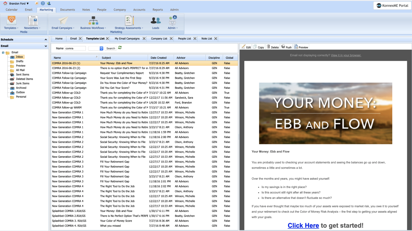
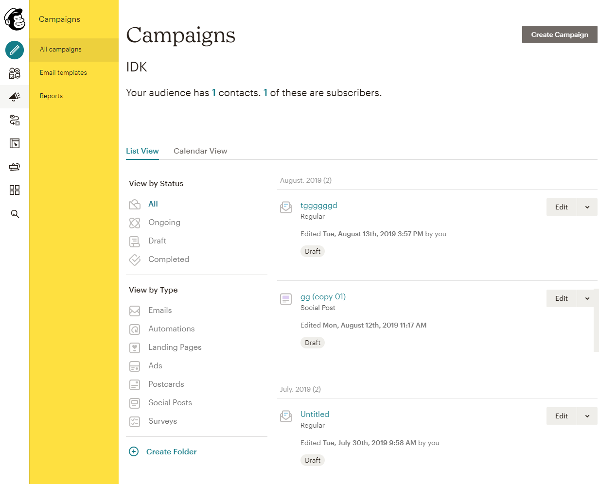
Admittedly, when I got started with this project I did not know much about email campaigns, CRM programs, or the financial industry in general. My first steps in this project were focused around understanding current functionality of the existing campaigns application (pictured below), how it integrated with the CRM and how it was used.

Not much research had been conducted prior to my arrival to the team. It was a goal of our UX team to flip the script and learn more about the connection our users were having with our applications. To do so, my UX colleagues and I initiated a large scale research project. We conducted 30+ user interviews over zoom and discussed their day to day responsibilities, work flows, any pain points they experienced within our apps, and much more… The data was all input to Trello where we could better visualize and organize all of our findings.
A Sample of Research Data Compiled in Trello
From interviews and my own exploration through the app, I learned that the email campaigns application often fails to provide feedback, a lot of confusing or misleading verbiage exists and it was hard to trust that it was actually performing the desired actions.
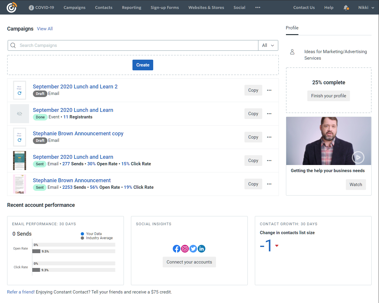
With this information in mind, I performed competitive analysis on other email campaigns services to see how our app compared with the rest of the industry. Mailchimp, Sales Force, and Constant Contact were all very handy resources as my team began making design and functionality decisions.

Now that I had a good feel of what email campaigns was lacking in and what other successful apps did well in, I felt confident that these were the most crucial improvements to be made:
The create campaign process needed to be re-done and turned into more of a helpful walkthrough for users.
Verbiage needed to be cleaned up to provide the user with better instruction on how to succeed in the app.
More feedback needed to be provided to ensure a better level of trust that the system is working with the user.
I began these improvements within the create campaign process by breaking steps up into separate modals with clear instructions on how to proceed. I decreased the amount of options and required inputs on each step to reduce cognitive overload. This added much needed structure and importance to crucial user flows within the app.
Create Campaign Flow Sketches
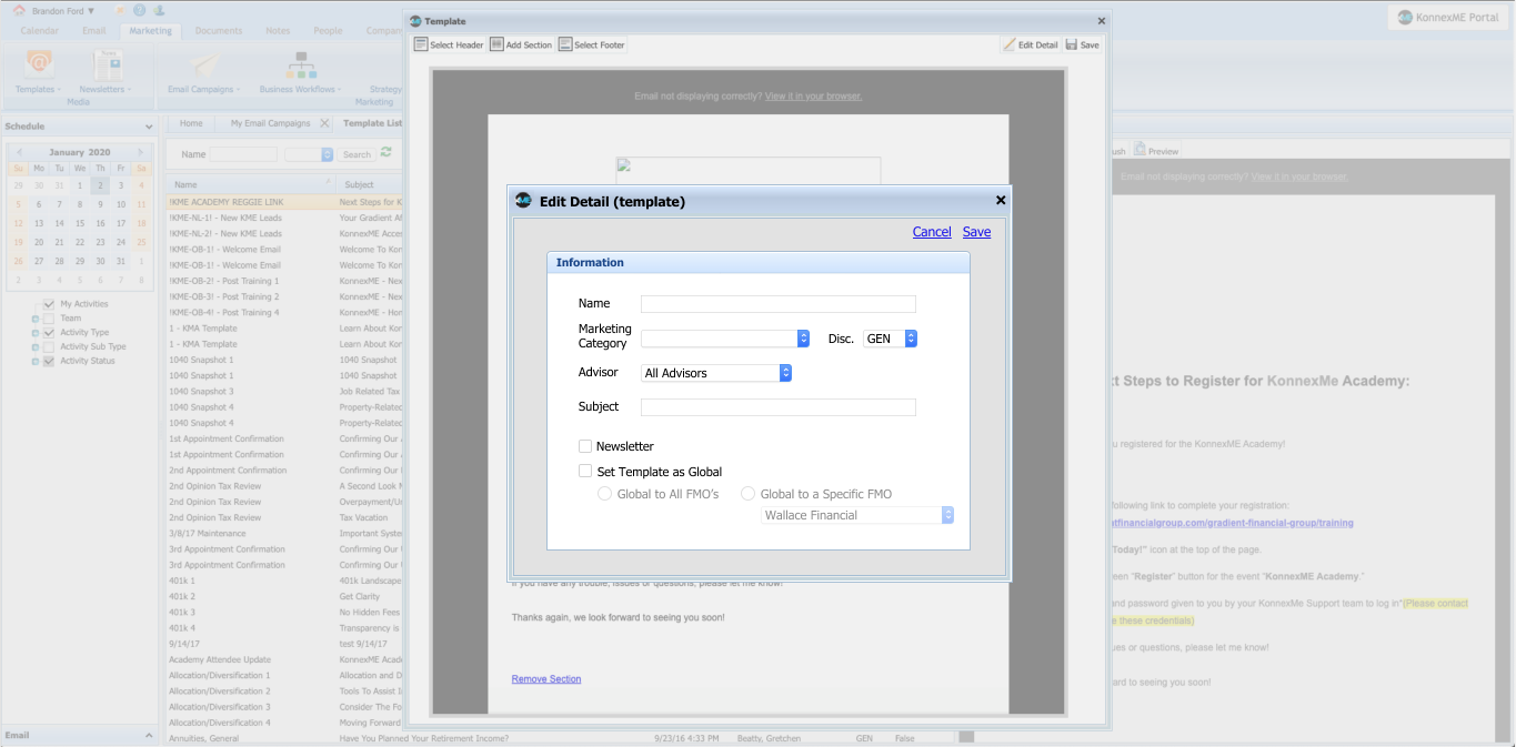
I applied the same thinking to other components within the app. My goal for component design was to find a nice balance of information to display to the user, highlighting important details and removing unhelpful stats or descriptions, depending on the context. The image below highlights updates to the template list with these goals in mind. This is what my in-progress work looks like. Here I was testing small visual design tweaks from card to card in different contexts. These cards are an updated version of the ‘VA Campaigns - Template List’ image shown near the top of this study.
In-progress work in Adobe XD
Many meetings and discussions were had concerning each component we were updating. The easy* part was creating a successful design, the problem was that every single thing in this new campaigns application had to tie back into the CRM, throwing many hurdles at our team to overcome.
These moments were huge roadblocks for our team, to which it was ultimately on me to figure out a solution to keep us on track for the sprint. My approach to these situations was to have conversations with other UX designers to generate more viable design solutions, dig into the minds of the developers to see what is possible to implement, and negotiate with “the business” to see how much wiggle room there is in potential solutions or requirements. There was always a fitting solution to these issues, some of them just took a little more collaboration to figure out.

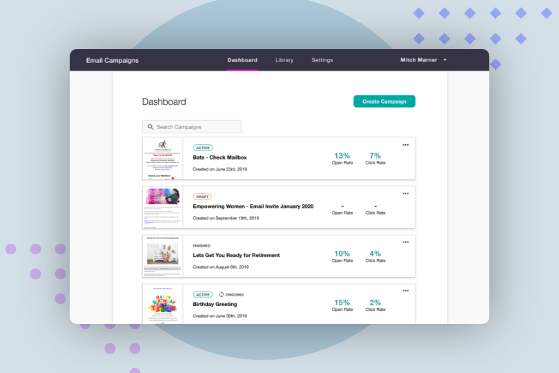
The GIF below walks through the entire new create campaign process, showcasing the new modal system. These solutions were a huge improvement for the user. The way the new application functions and an user’s mental model of how this type of app should function is much more aligned after these updates.
The process begins at the Dashboard when the Create Campaign button is clicked. The user then makes only one or two decisions at a time, with clear direction along the way. The rest of the setup progresses through a stepper, page system where the rest of the campaign options were regrouped and organized, again to increase understandability and user confidence.
Finalized Create Campaign Flow
At one point in the development cycle we learned that the most up-to-date web app was going to be offline for a considerable amount of time. While this was not an issue for users, the UX team and “the business” referred to the web app very frequently to discuss the current and future state of our project. After about a week without having access to the web app, I felt like I was thinking in never ending loops and started second guessing every decision because I was not able to use the app as a functioning program to test my ideas.
My solution was to compile all of my small single-feature projects in Adobe XD into one mammoth prototype in order to mimic the functionality in the app so our team could continue making sound decisions. You can view this prototype by clicking below!
Reflection
Working on this application was the perfect opportunity to sharpen my visual design chops, further develop my research conducting and analysis skills and to learn how to function on a team in a tech company. While the UX team did initiate a hefty research project, even more research would have helped. We could have conducted more user tests and interviews before jumping into the design process. This would have increased understanding in how email campaign applications work and how they exist within the financial services realm. The design process would have been accelerated and done with more confidence in decision making.
My team was agile with design and functionality in this app almost at a day-to-day level. This was a good and bad thing for us. It was good because this was a brand new application we were working on and we had some room to experiment and look at different options but also bad in that it was tough for everyone on the team to keep up with what the most current functionality/design decisions were. Next time around, I would do a better job in documenting important decisions made by my team and to utilize research data to implement more concrete decisions to better create a foundation to build upon.